

In the iGaming industry, mobile-first design is no longer a differentiator – it has become the minimum standard for any betting platform aiming to attract and retain players.
Mobile devices now account for the majority of betting activity worldwide, pushing operators to ensure that sportsbooks, casino games, instant-win titles, and live dealer interfaces perform reliably on smaller screens, fluctuating network conditions, and a wide range of device capabilities.
This article explores how mobile-first principles, responsive frameworks, and performance-oriented UI strategies help operators deliver seamless betting experiences across devices — without sacrificing speed, usability, or scalability.
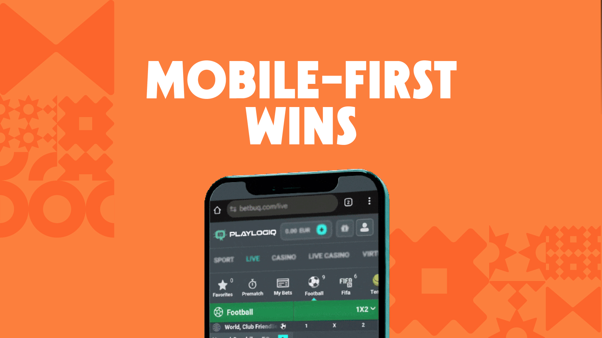
Why Mobile-First Design Leads the iGaming Ecosystem
Mobile-first design means starting from the smallest screen and building upwards – ensuring that layouts, navigation, and interactions are designed first for mobile users, where most betting activity actually happens.
In iGaming, where speed, clarity, and ease of use directly influence player behaviour, this approach has a measurable impact on conversion rates, engagement, and retention.
Rather than adapting desktop products to mobile as an afterthought, leading operators now prioritise:
- Touch-optimised controls for quick bets, slot reels, and in-game actions
- Simplified user flows that reduce friction on smaller screens
- Performance-focused rendering, balancing visual quality with loading speed
- Lightweight assets that perform reliably on lower-bandwidth connections
- Adaptive layouts that remain consistent across smartphones, tablets, and desktops
For players, the expectation is simple: instant access, fast loading, and intuitive navigation.
Mobile-first design is what makes that experience possible.
Core Principles of Effective Mobile-First iGaming UI
1. Prioritize the Essential actions Above the Fold: Mobile screens offer limited space, so the most important player actions – place a bet, spin, log in, deposit – must be immediately visible and accessible. Reducing visual clutter and focusing on primary actions lowers cognitive load and helps players move faster through key flows.
2. Optimize Navigation for Single-Hand Use: Most mobile betting sessions happen on the move. Designing interfaces around thumb-friendly zones significantly improves usability. Menus, bet slips, and core CTA buttons placed within easy reach – along with floating action buttons and gesture-based controls – make interactions feel natural rather than forced.
3. Design for Performance, Not Just Aesthetics: Visual quality matters, but not at the expense of speed or stability. Heavy animations and large assets can quickly degrade the experience on mid-range devices or slower connections.
Mobile-first iGaming products typically rely on:
- Optimized image sprites
- Framerate-appropriate animations
- SVG-based icons
- Lazy loading of game assets
These techniques reduce CPU strain and prevent lag that disrupts gameplay.
Ensure Scalable Design Systems Across Devices: Players often switch between smartphones, tablets, and desktops. Flexible UI frameworks – such as React Native, Flutter, Vue, or responsive CSS systems – help maintain visual consistency and functional stability across screen sizes and orientations, without duplicating development effort.
Adaptive UX for Betting: Responsiveness Beyond Screens
Mobile-first design goes beyond simply resizing interfaces. In betting environments, it means adapting the experience to real-world constraints that players face every day:
Key considerations include:
- Variable network conditions: Optimising APIs, compressing assets, and using smart caching strategies helps maintain usability even on unstable or slower connections.
- Limited devide resources: Many users rely on mid-range smartphones. Efficient memory usage and lightweight frontends reduce crashes, overheating, and performance drops during gameplay.
- Short user sessions: Mobile bettors often interact with platforms in brief moments of downtime. Streamlined navigation and fewer steps per action improve conversion for time-sensitive bets.
In high-intensity scenarios such as in-play betting or live dealer sessions, these factors become critical. A responsive UX is not just about layout – it’s about ensuring continuity, speed, and reliability when timing matters most.
Launch Fast on Mobile: Why White Label Platforms Embrace Mobile-First by Default
Launching a mobile-ready betting platform from scratch involves far more than interface design. It requires responsive UI frameworks, testing across dozens of devices, performance optimisation, and security hardening – all before a product is ready for market.
White label platforms address these challenges by embedding mobile-first principles directly into their core architecture. Typically, this includes:
- Mobile-first frontends designed specifically for betting interactions on small screens
- Pre-optimised UI kits built for speed, clarity, and touch-based navigation
- Cross-device compatibility tested across a wide range of smartphones and tablets
- Native support for WebView environments and mobile app wrappers
For new operators, this approach removes much of the technical complexity associated with mobile optimisation. Instead of building and maintaining multiple frontends, they gain access to a pre-tested, responsive interface that is production-ready from day one.
This advantage is particularly relevant in emerging markets, where mid-range devices dominate and performance efficiency has a direct impact on user conversion. In these contexts, a mobile-first frontend is not just a design choice – it’s a critical operational requirement.
Frameworks and Technologies Behind Modern Mobile-First Betting
Modern iGaming frontends increasingly rely on component-based development and lightweight frameworks that allow teams to iterate quickly without compromising performance.
Commonly adopted technologies include:
- React / React Native, for modular interfaces and cross-platform flexibility
- Flutter, for consistent UI rendering and smooth animations across Android and iOS
- js for lightweight and reactive user interfaces
- Tailwind or responsive CSS grids for consistent layouts
- Canvas and WebGL rendering for game engines
For operators running legacy platforms, adopting a mobile-first approach often requires deeper architectural changes. Monolithic frontends are gradually replaced by modular components, and UI flows are redesigned starting from mobile constraints rather than desktop layouts.
Future Trends: Adaptive, Intelligent, and Hyper-Personalized Mobile UX
Mobile iGaming UX continues to evolve alongside player behaviour and device capabilities. Rather than a single dominant trend, several directions are emerging in parallel:
- Interface personalisation informed by player behaviour and preferences
- Faster, gesture-based interactions for common betting actions
- Layouts that adapt dynamically to usage patterns rather than fixed breakpoints
- Lightweight game engines optimised for cloud delivery and streaming
- Seamless session continuity across devices
Not all of these approaches will become standard overnight, but platforms designed with flexibility in mind are better positioned to adapt as expectations shift.
For a closer look at how automation and AI are influencing interface design, explore our article on The Future of iGaming Design: Generative AI in Action.
Why Mobile-First Is Now the Default Standard in iGaming
Mobile-first design has moved from innovation to expectation. Today, players judge betting platforms by how quickly they load, how easily they can place a bet, and how consistent the experience feels across devices.
From simplified interfaces and performance optimisation to cross-device consistency, operators that prioritise mobile experiences tend to see stronger engagement and more sustainable retention over time.
Whether scaling an existing brand or launching a new one, embracing mobile-first principles — and leveraging platforms that deliver them by design — helps ensure betting products remain usable, competitive, and future-ready wherever players choose to play.


